
On both the Reading and Writing sections of the SAT, there are questions that incorporate graphs, charts, and tables. On the Reading section, the Official SAT Study Guide refers to these questions as "interpreting data presented in informational graphics." On the Writing section, they're referred to as "drawing connections between words and data." Both question types contribute to your Command of Evidence subscore.
For the purposes of brevity and clarity, I'll call the Reading and Writing questions that use data and graphics quantitative questions. In this article, I'll explain the different types of quantitative questions on Reading and Writing. Furthermore, I'll give you example questions and strategies to help you correctly answer quantitative questions on the SAT.
Quantitative Questions on the SAT
There are quantitative questions on both the Reading and Writing sections of the SAT. Typically, there will be about 3-6 quantitative questions on Reading and 1-2 on Writing.
If you understand the different types of quantitative questions and practice understanding how data is presented on the SAT, you should be able to correctly answer these questions. I'll walk you through the three major types of quantitative questions on Reading and Writing, and I’ll provide a step-by-step approach for answering each type of question.

Type #1: Data Questions
These are direct questions that test you on whether you can read the information that’s presented. They're the most straightforward quantitative questions. I’ll provide examples and guidance for how to answer these questions.
On these types of questions, the first step is to carefully read the graph. Make sure you understand what it's showing and how the information is being displayed. Then, determine what the question is asking. These questions are fairly basic, so you're most likely to make a mistake by either misinterpreting the graph or the question.
Finally, you need to refer back to the graph to locate the answer. The information on the graph will directly support your answer choice.
Let's take a look at a couple of examples of these types of questions.
SAT Examples
Follow the steps I provided to answer this data question from a practice SAT.
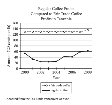
Before attempting to answer the question, familiarize yourself with the graph. You’re most likely to make a mistake by rushing or being careless and reading the graph incorrectly. Make sure you understand each component of the graph.
The graph is comparing regular coffee profits to fair trade coffee profits over time. The top line with the unshaded circles is graphing the profits of fair trade coffee. The bottom line with the shaded circles is graphing the profits of regular coffee. The X-axis, or horizontal line, shows the year and the Y-axis, or vertical line, is the amount of profit in US cents per pound.
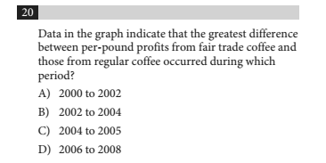
Next, let’s look at the question and determine what it’s asking. The question is asking us to identify the time period when the difference between profits from fair trade and those from regular coffee was largest.
Refer back to the graph to find the answer. On the graph, the period when the difference between the profits was largest corresponds with the points on the graph where the distance between the top line and the bottom line is the largest. Quickly, you can see that the largest difference between the profits occurred during 2002-2004. The correct answer is B.
If you didn’t realize the distance between the lines corresponded with the difference between the profits, you could have identified the profits for fair trade and regular coffee from the graph for each answer choice and calculated the difference between them. This would be a longer process, but you would still arrive at the correct answer.
Here's another example of this type of question. Remember to follow all the necessary steps to answer the question.
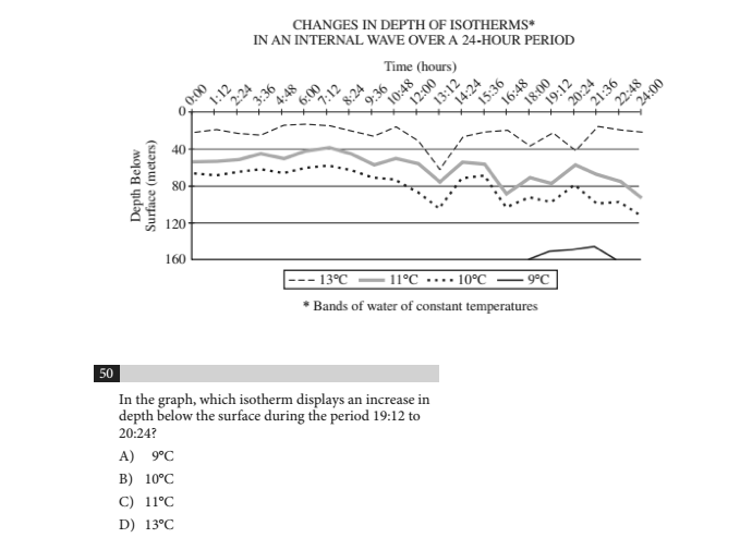
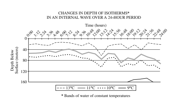
Again, let’s take a look at the graph first. The graph is showing changes in the depth of isotherms over a 24- hour period. The X-axis is the time of day, and the Y-axis is the depth below the surface in meters. The top line in the graph represents the isotherm of 13 degrees Celsius. The lines below represent the isotherms of 11, 10, and 9 degrees.
Now, we’ll determine what the question is asking. We have to identify the isotherm that shows an increase in depth during the period 19:12 to 20:24. At this point, we’ll refer back to the graph to find our answer.
If you take a look at the Y-axis, you’ll notice that a lower point on the Y-axis corresponds with a greater depth below the surface. Therefore, to answer our question, we need to find the isotherm in which its line moves down from 19:12 to 20:24. The only isotherm that shows a downward trajectory from 19:12 to 20:24 is 13 degrees Celsius. The correct answer is D.

Steven Depolo/Flickr
Type #2: Interpreting Data
These questions require you to draw a conclusion or support a statement based on the data. You have to be able to determine what the information means. For these questions, it's easiest to go through the answer choices to determine which one is accurate based on the data.
First, again, make sure you know what the question is asking. After you understand the question, look through the answer choices. For each answer choice, refer to the data to conclude whether or not the graphical information supports the answer choice.
If the data doesn't support the statement in the answer choice, eliminate that choice. Continue to eliminate answers until you find the correct one.
Follow these steps on the following SAT example questions.
SAT Examples
Check out this interpreting data question from the Reading section.
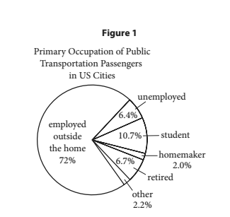
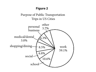
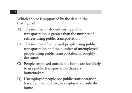
We have to use the information from the graph to determine which statement is true. Again, for these questions, it’s easiest to go through the answer choices to determine which one is supported by the data.
Let’s start with answer choice A and refer to the first figure. We have to determine if the number of students using public transportation is greater than the number of retirees using public transportation. From the pie graph, we can see that 10.7% of passengers are students and only 6.7% are retirees. The figure does support answer choice A.
We can quickly go through the other choices to ensure that A is correct. For answer choice B, employed people are 72% and unemployed people are only 6.4% of passengers; therefore B is untrue. For answer choice C, homemakers are only 2% of passengers and those employed outside the home are 72%, so C is untrue.
For answer choice D, in the figure, there is no mention of how often various groups use public transportation. The figure graphs the occupations of the passengers, but it says nothing about the frequency with which they use public transportation. Therefore, D is not supported by Figure 1, and the correct answer is A.
Let’s try one more interpreting data question from the Writing section:

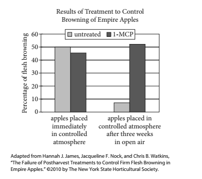
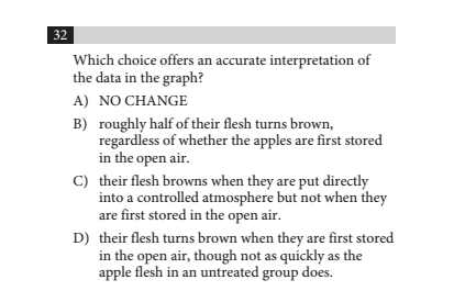
Based on the sentence from the passage, we have to determine what happens when Empire apples are treated with 1-MCP. The dark bars represent apples that were treated with 1-MCP. Let’s go through the answer choices to see which one is true based on the data in the graph. For each answer choice, we'll refer back to the graph to see if the statement is an accurate interpretation of the data in the graph.
Answer choice A is wrong because the graph shows that Empire apples experience almost 50% browning after being treated with 1-MCP and placed immediately in a controlled atmosphere.
Answer choice B appears to be true. The data indicate that roughly 50% of the apple flesh browned with 1-MCP treated apples placed in the open air and those immediately placed in a controlled atmosphere. The dark bar on the right is a little more than 50%, and the dark bar on the left is a little less than 50%.
Answer choice C is incorrect because both dark bars show that there is browning.
Answer choice D is wrong because there is more browning with 1-MCP apples that are stored in the open air than there is with apples that weren’t treated with 1-MCP and stored in the open air.
The correct answer is B.

Side Stage Collective/Flickr
Type #3: Combining Data With Information From the Passage
These questions require you to understand the data and what’s written in the passage. You have to decide if the data supports information in the passage and vice versa. Often, you can answer these questions with just the data or only a basic understanding of the passage.
Like all quantitative questions, first make sure that you comprehend the passage. Then, similar to the interpreting data questions, you have to go through the answer choices to determine if the data support the answer choice.
Finally, you may have to refer to the passage to ensure that both the data and the passage reflect an answer choice before you make your selection.
Check out these examples from practice SATs.
SAT Examples
Here’s an example from the Writing section:
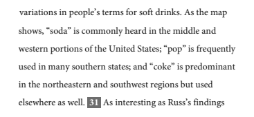
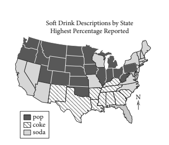
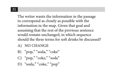 First, we must determine what the question is asking. Based on the map, we must figure out which term is heard in the middle and western portions of the US, which term is used in the south, and which term is used in the northeastern and southwestern US. The terms should be placed in order: middle and western US first, south next, and then northeastern and southwestern US.
Next, let’s look at the map to determine which terms are used in the different regions. In the middle and west, “pop” is the popular term. The dark shaded color in that area corresponds with use of the word “pop.” In the south,“coke” is the term of choice. The diagonal lines in that area correspond with using the word “coke.” Finally, in the northeastern and southwestern US, “soda” is the word commonly used as indicated by the lightly shaded area.
Therefore, the answer should be “pop,” “coke,” “soda." Look at the answer choices to find the correct answer. The correct answer is C.
Here's one more example from the Reading section:
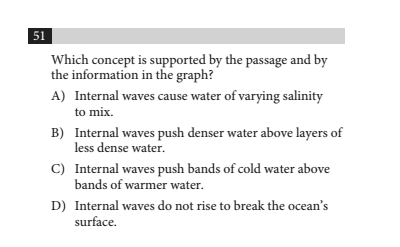 Because the correct answer has to be supported by the passage and the graph, we can first eliminate the answer choices that are not supported by the graph.Answer choice A can be eliminated because the graph doesn’t provide any information about salinity.
Based on the graph alone, you may not know which layers of water are denser, so for now, we’ll leave answer choice B. Answer choice C can be eliminated, because the graph indicates that the colder bands are lower. Based on the graph, answer choice D is correct. None of the waves go above 0 meters. We’re left with B and D. Now we can go to the passage to see which choice is supported by the passage.
Let’s start with B. This is taken directly from the passage:

The passage states that colder water is denser, and the graph shows that the colder water is below the warmer water. Therefore, B can’t be correct. Now let’s confirm that D is the right answer. These are the first 3 sentences of the passage:

The passage clearly states that internal waves are underwater, and the graph shows that the internal waves never rise above 0 meters. The correct answer is D.

Strategies for Quantitative Questions on Reading and Writing
Here are some tips to keep in mind that will help you with the quantitative questions on Reading and Writing.
Ignore the Data in the Passage Until You’re Answering the Related Questions
If you see a graph or chart in a passage, disregard it until you attempt to answer the questions based on the data. You’ll have to refer back to the graph or chart when you’re answering the questions, so you don’t have to waste time looking at the data beforehand.
Familiarize Yourself With the Data Before Answering the Question
Before selecting an answer to a quantitative question, understand each component of the graph or chart. Know what’s being measured and exactly how it’s being measured.
Make sure to read the labels and scales. If you incorrectly identify what's being measured on the x-axis or y-axis of a graph, then you're likely to get the question wrong. Similarly, if you don't correctly determine what each bar or line is measuring in a graph, you'll have difficulty correctly answering the quantitative questions.
When Answering Questions That Ask You to Interpret the Data, Go Through the Answer Choices to Determine the Correct Answer
For questions that ask you to identify which statement is true based on the data, go through each statement to see if it’s supported by the data. If one of the answer choices makes a claim that is either proven incorrect by the data or can't be directly supported by the data, then you should eliminate that answer choice.
The correct answer will be the only one that is definitively proven by the graphical information. Oftentimes, there will be an answer that seems plausible, but it can only be the correct answer if it's supported by the evidence.
Only Refer Back to the Passage if Necessary
For most quantitative questions, you can rely solely on the data to answer the question. If you have to go back to the passage to confirm your answer choice, do as much as you can with the just the data to eliminate answer choices before referring to the passage. This will save you time.
What's Next?
Quantitative questions first appeared on the SAT in March of 2016. Find out how the Reading and Writing sections have changed.
Also, you may want to learn how to excel on the SAT essay.
Finally, learn from a perfect scorer how to get a 1600 on the SAT.
Want to improve your SAT score by 160 points?
Check out our best-in-class online SAT prep program. We guarantee your money back if you don't improve your SAT score by 160 points or more.
Our program is entirely online, and it customizes what you study to your strengths and weaknesses. If you liked this Writing and grammar lesson, you'll love our program. Along with more detailed lessons, you'll get thousands of practice problems organized by individual skills so you learn most effectively. We'll also give you a step-by-step program to follow so you'll never be confused about what to study next.
Check out our 5-day free trial:
Have friends who also need help with test prep? Share this article!

Justin has extensive experience teaching SAT prep and guiding high school students through the college admissions and selection process. He is firmly committed to improving equity in education and helping students to reach their educational goals. Justin received an athletic scholarship for gymnastics at Stanford University and graduated with a BA in American Studies.
























 Holly R.